
Tynton Farm Therapies
Wellness Branding & Illustrative Logo Design
Tynton Farm Therapies is a holistic therapy practice nestled within a beautiful 26-acre farm in the Garw Valley, near Bridgend. Run by Elyssa, it offers a wonderfully varied collection of treatments, including reiki, reflexology, crystal healing and other complementary therapies, all with a strong connection to nature, wellbeing and spirituality.
This was a particularly unusual and fascinating wellness branding project, as the starting point was something deeply personal to my client.
Elyssa describes herself as a White Witch and has a lifelong connection with the spiritual world. She had actually seen the shapes and colours of her logo in a vision and drawn the original design herself. My role wasn’t to reinvent her idea, but to take something that already held enormous meaning for her and develop it into a finished, professional identity while staying true to her vision.
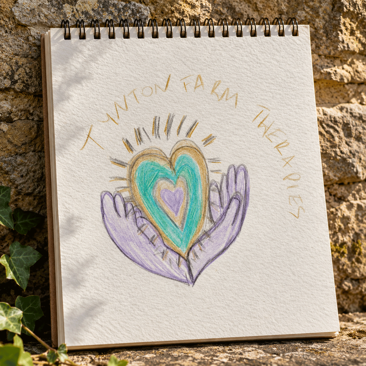
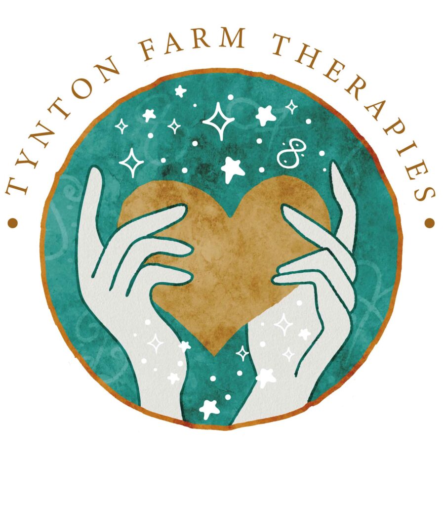
Working with Elyssa’s original artwork, I developed the finished logo, retaining the central imagery of hands holding a heart, surrounded by stars and the very light codes which are so important to her.
The rich turquoise, warm golden tones from her original imagining and textured, hand-crafted finish give the design an earthy, slightly mystical quality that feels perfectly suited to the business.
It was important to preserve the individuality and hand-rendered character of Elyssa’s original drawing while ensuring the finished logo was clear, balanced and practical to use.
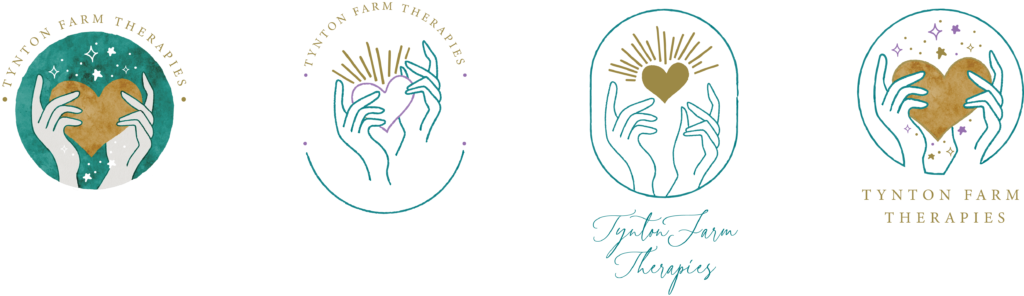
Bringing the vision to life
Working with Elyssa’s original artwork, I developed the finished logo, retaining the central imagery of hands holding a heart, surrounded by stars and the very light codes which are so important to her.
The rich turquoise, warm golden tones from her original imagining and textured, hand-crafted finish give the design an earthy, slightly mystical quality that feels perfectly suited to the business.
It was important to preserve the individuality and hand-rendered character of Elyssa’s original drawing while ensuring the finished logo was clear, balanced and practical to use.
What I particularly enjoyed about this project was the opportunity to work in a slightly different way. Rather than developing a concept entirely myself, I was helping someone translate something very personal and meaningful into a visual identity that could represent their business.
It’s a lovely reminder that successful wellness branding, or indeed any branding, isn’t always about coming up with something completely new. Sometimes it’s about listening, understanding and using design skills to bring somebody else’s vision beautifully to life.