

The Syndicate
Branding Design, Brochures & Promotional Materials
The Syndicate is an exclusive private members’ golf club offering access to some of the UK’s most prestigious courses.
I was brought on board at the very beginning to develop the branding design and visual identity for this exciting new business, giving it a distinctive personality and helping it stand out in the golfing world.
The brief was to create something sophisticated and premium, reflecting the exclusivity of the club without feeling stuffy or overly traditional.
The Logo
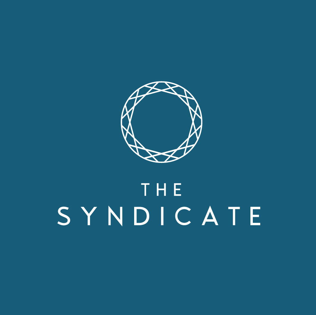
The inspiration for The Syndicate’s final logo came from the very heart of the business – its network of prestigious golf clubs and the connections it creates between them.
I developed a distinctive circular logomark made up of a series of overlapping, interconnected lines. These lines represent the network of partner clubs and their members, while together they form a subtle, abstract suggestion of a golf ball. It’s a simple idea that brings together two important aspects of the business – golf and the sense of connection and community that membership offers.
I deliberately avoided the more obvious golfing imagery, creating something contemporary, elegant and a little more intriguing. The geometric design gives the logo a sense of movement and depth, while remaining clean and recognisable, even at smaller sizes.
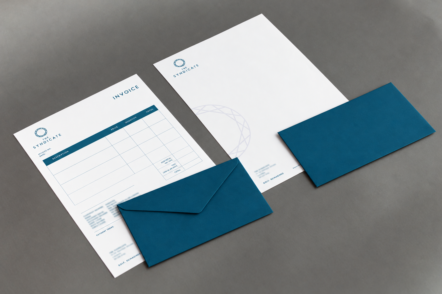
The result is a versatile symbol that works beautifully alongside The Syndicate name but is also strong enough to stand on its own. It’s since become a key part of the brand identity, appearing across merchandise brochures, stationery, membership and promotional materials and event signage, helping to create a distinctive and consistent look wherever the brand appears.
Bringing the brand to life
Since the initial branding design project, I’ve continued to work closely with The Syndicate, creating a growing collection of printed and digital marketing materials that put the new identity to work.
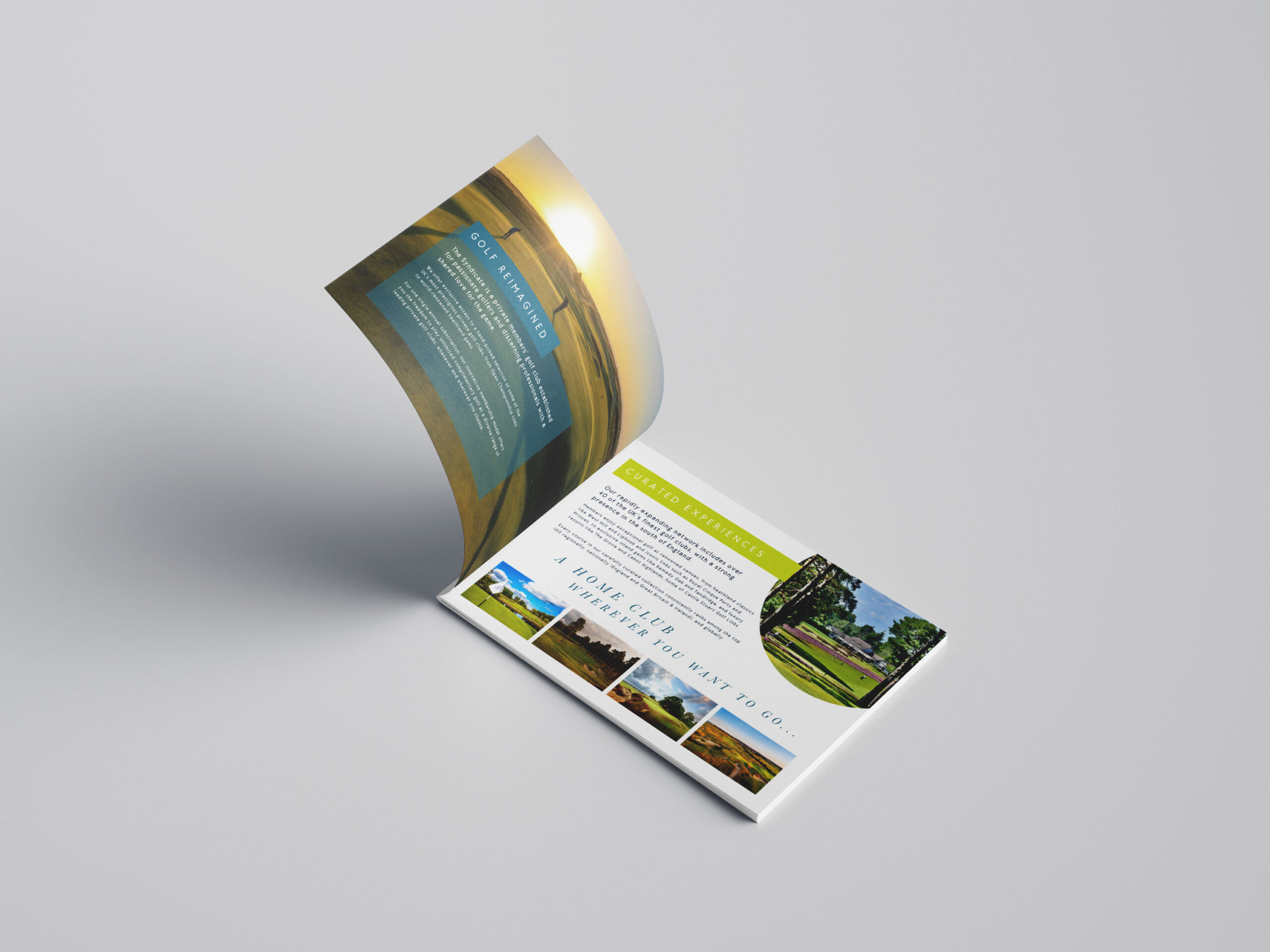
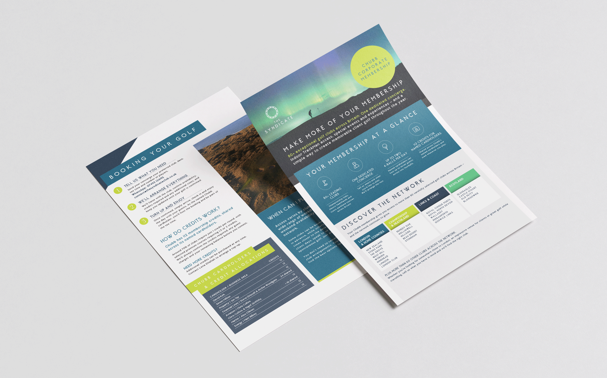
A large part of this has been the design of membership brochures, introducing prospective members to the club, its benefits and the impressive network of golf courses available to them. Combining beautiful course photography with carefully considered layouts, these publications needed to feel suitably premium while presenting a considerable amount of information in a clear, engaging and easy-to-navigate format.
What I particularly enjoy about this ongoing work is finding new ways to use the brand. Each project brings something different, whether it’s a beautifully presented brochure, a practical information guide or a striking piece of event signage. The challenge is to make each piece work brilliantly in its own right while keeping everything unmistakably The Syndicate.
It’s been lovely to see the brand develop alongside the business and to continue playing a part in shaping how it’s presented. A great example of how a strong visual identity is much more than a logo – it’s the foundation for a whole range of creative, consistent and effective design.
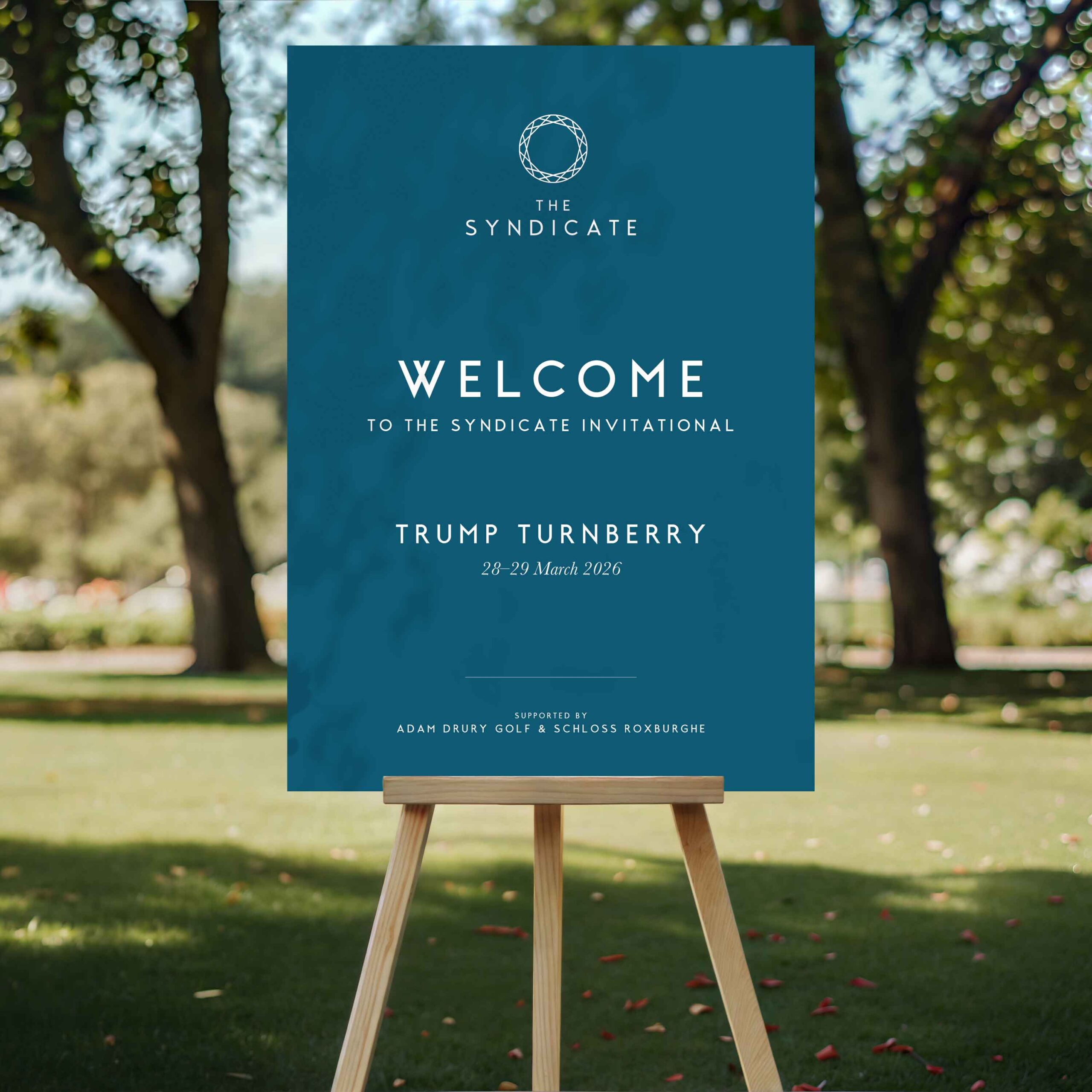
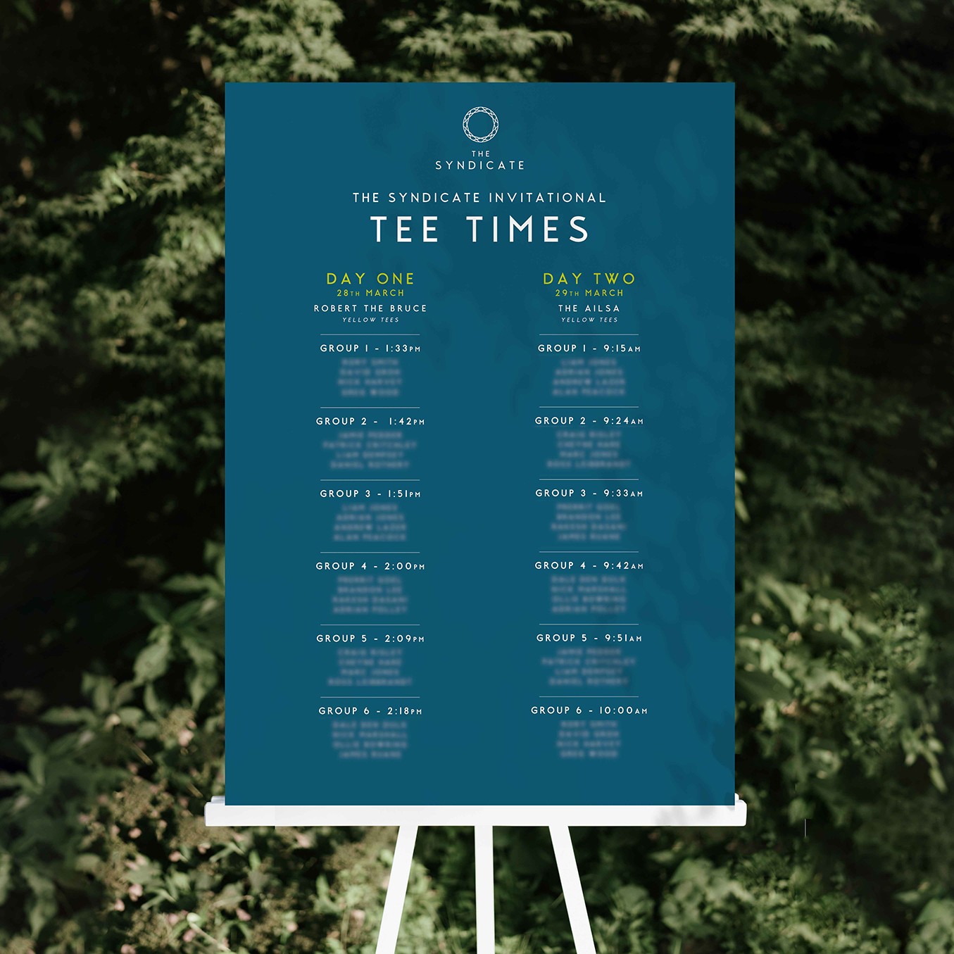
The Syndicate also hosts exclusive golfing events, for which I’ve created large-format welcome boards and event signage. These pieces give the brand a physical presence at some wonderful venues, using bold, elegant typography and the distinctive Syndicate identity to create a professional and welcoming first impression.
An evolving brand
What I particularly enjoy about this ongoing work is finding new ways to use the brand. Each project brings something different, whether it’s a beautifully presented brochure, a practical information guide or a striking piece of event signage. The challenge is to make each piece work brilliantly in its own right while keeping everything unmistakably The Syndicate.
It’s been lovely to see the brand develop alongside the business and to continue playing a part in shaping how it’s presented. A great example of how a strong visual identity is much more than a logo – it’s the foundation for a whole range of creative, consistent and effective design.
View similar branding design in my portfolio